I redesigned the entire website: a ground-up rebuild of brainjuiceart.com around the brand’s own character. The default storefront became a pixel-art world with artist-first browsing, where shopping is part of the visit rather than the point of it. Sole designer, research through WooCommerce launch.
I designed nvertproductions.com from zero to launch. There was no site before it, just sixteen shipped titles trapped in a PDF. The build turned that track record into an investor-facing slate, with the pipeline and the team laid out as proof. Sole designer, research through Squarespace launch.
Working on Narval's existing Wix base, I redesign the site around whichever film leads the studio's slate. The 2023 rebuild gave it one flexible film template that carries coming-soon, released, and archive states, so each new lead title ships without new design work.
The pain: PC waste heat, thrown away by design. The cut: a system concept that loops it back as household warmth: hardware story, interface, and the pitch that carries both. The effect: a student project that argues with a working narrative, not a poster.
HEATLOOPPC heat → warmth
SPEC. 02 — HACKATHON
FALZ
Product Design · Chrome extension
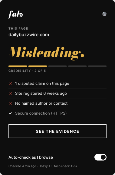
The pain: we like before we think. The cut: a fact-checking layer that lands the receipt right where the impulse lives: judge before you like. The effect: a hackathon build with one sharp behavioural thesis.
FALZjudge before you like
ABOUT / 02
[ Section headline placeholder ]
[ Placeholder paragraph one. Two or three sentences on how a project runs from the client's side: what gets asked, what gets researched, what gets decided. ]
[ Placeholder paragraph two. Training, base city, and the kind of problem worth sending over. ]
[ Coupon headline ]
[ Placeholder. One short call to action, plus the line that says how to reach out. ]
NYU student project · 2021 · revisited 2026 · Figma
HeatLoop: turn PC waste heat into personal warmth.
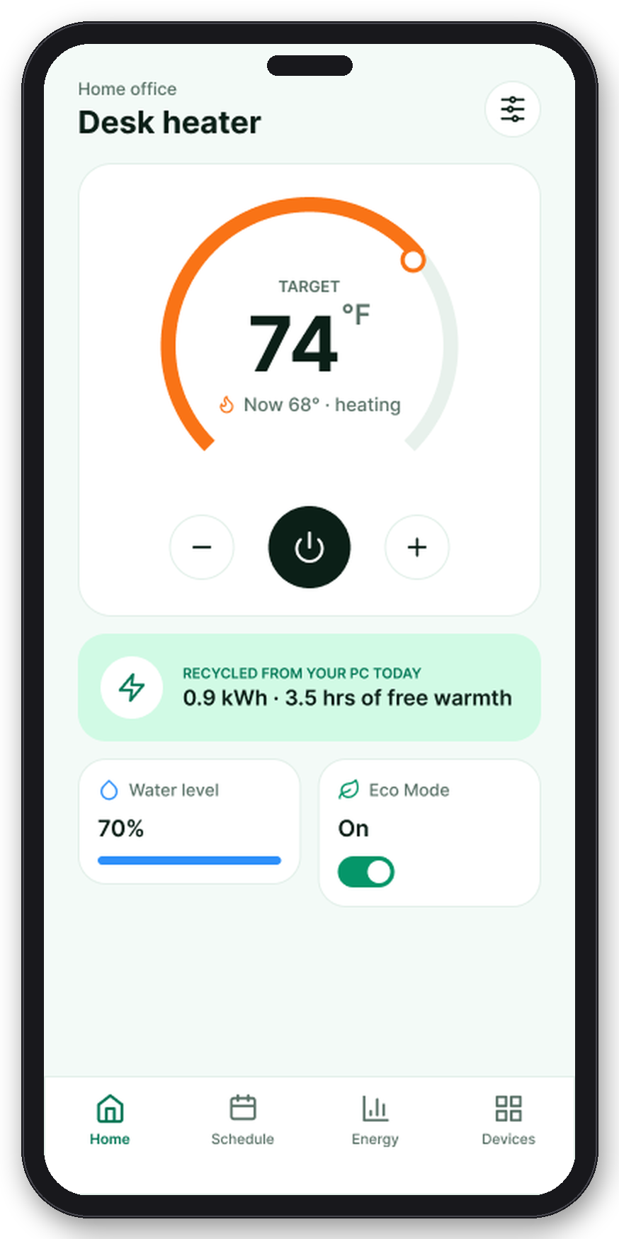
A desktop PC breathes a hundred watts of warm air into the room all day. Eight inches away, its owner sits wrapped in a blanket, feet on a 1500-watt space heater. HeatLoop is a desktop unit that ducts that exhaust into a personal comfort radius, paired with an app for control, schedule, and proof. I designed everything end to end: the hardware concept, the research, and the 18-screen app, twice.
ROLE — sole designer, end to endDELIVERABLES — hardware concept · 18-screen app · two visual buildsTOOLS — Figma
// The problem, in numbers
The heat is already paid for. It is just pointed the wrong way.
60–120 Wof heat a desktop PC dumps into the room, all day
1500 Wthe space heater running beside it to keep one person warm
The product’s whole reason to exist is that loop: capture the exhaust, re-radiate it into a 0.8-meter comfort zone, and back it with a small booster only when needed. The catch is that an invisible energy loop is worthless if the interface cannot make it visible, trustworthy, and effortless.
// Two people, one desk
Both personas sit next to a warm computer. They want different things from it.
The WFH renter
Works at the desk all day, cannot touch the building thermostat, watches the electricity bill. Wants steady comfort and proof the recycled heat is actually saving something.
The night-owl streamer
The PC runs hot for hours on a schedule. Wants the heater to follow the machine: on when the rig spins up, off when the stream ends, without ever thinking about it.
The two of them anchor the feature set: the renter drives the energy story, the streamer drives automation and the smart timer.
How might we make an invisible, slightly nerdy energy loop feel effortless, trustworthy, and worth caring about on a 375-pixel screen?
// Where v1 broke down
The first prototype had 27 screens and four ways to get lost.
I audited the original build screen by screen before redesigning anything. Four findings did most of the damage:
Two navigations, fighting
A hub of icons and a bottom tab bar coexisted, each claiming to be the way around. Every task had two competing routes.
One number, two jobs
A single temperature reading stood for both target and current. You could not tell what the device was doing, only what it showed.
The hero metric, invisible
Recycled heat, the only reason this product exists, appeared nowhere in the interface. The app looked like any generic thermostat.
Pairing by serial number
The only way to connect the device was typing a serial code, with no error states. One typo and the journey ended silently.
// The system
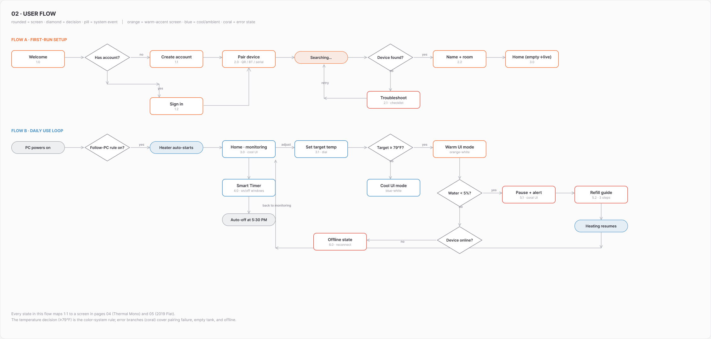
One IA, and a flow drawn with its failure branches.
The rebuild started on paper: two personas, a first-run flow that includes the ways it can go wrong (pairing failure, empty tank, offline), and wireframes renumbered onto one four-tab structure: Home, Schedule, Energy, Devices. Every screen that follows traces back to a box on this map.
First-run flow · pairing, naming, and every failure branch drawn before any UI
// Designed details
Six decisions the screens have to defend.
01 · Two numbers, always
Target is a decision. Current is a fact. They never share a digit.
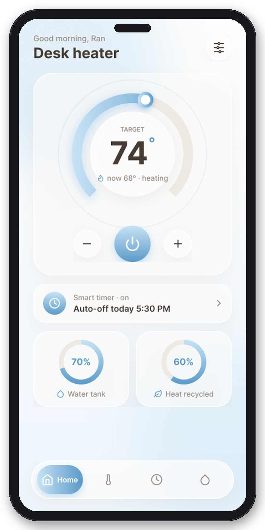
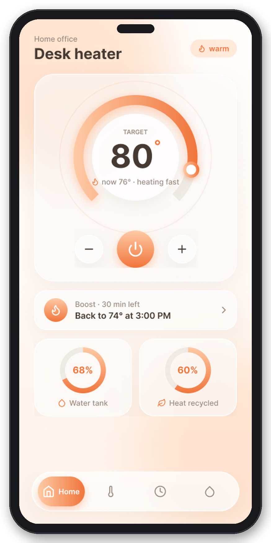
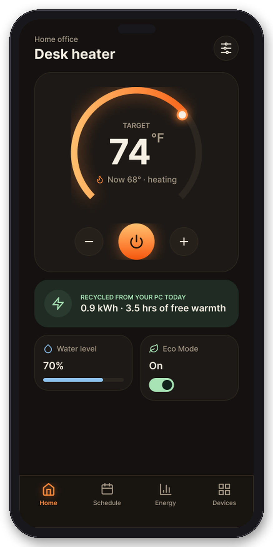
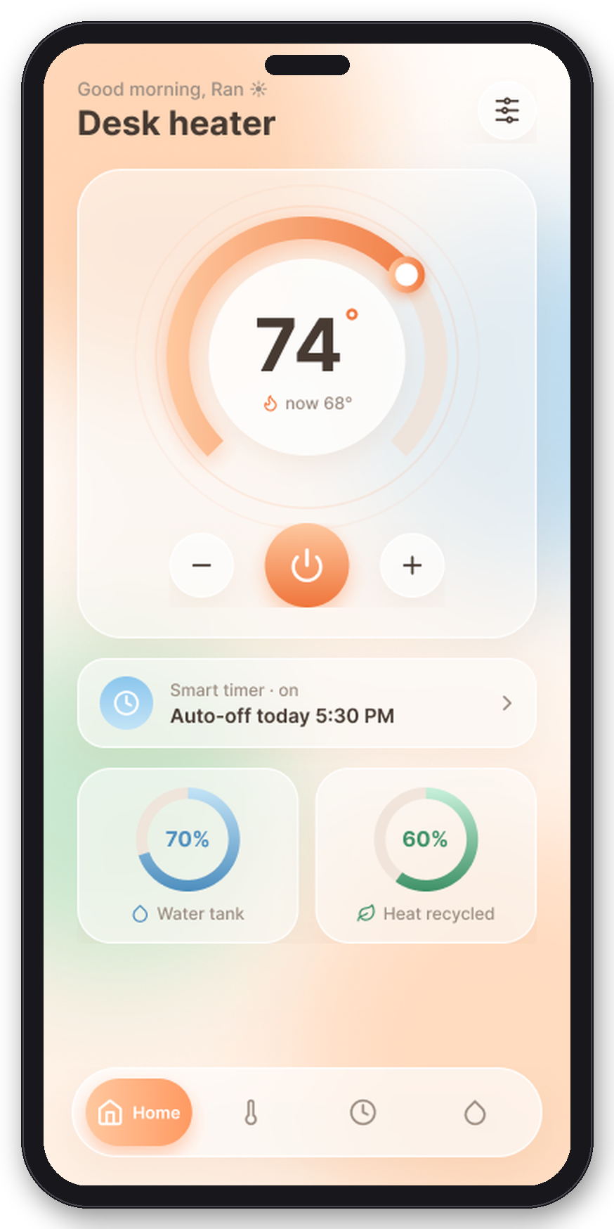
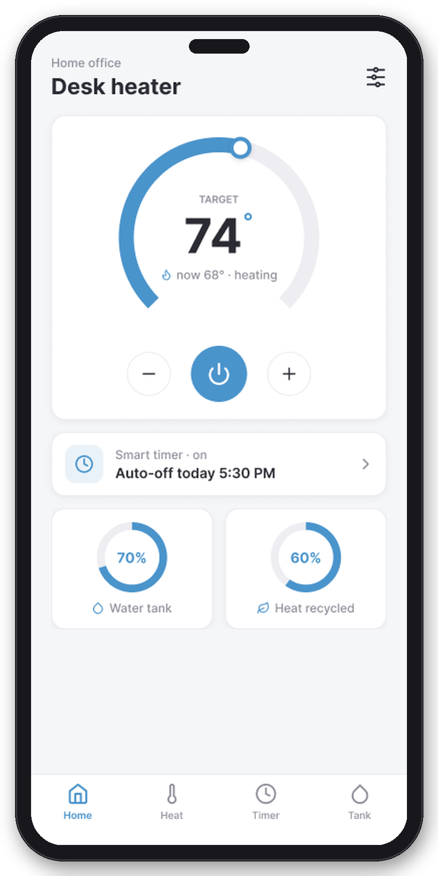
The dial gives the target the big type and the current temperature a small live line underneath, with the device state spelled out: now 68°, heating. Power and temperature controls sit in the content, under the dial, never in the nav bar where a mis-tap kills the heat. The recycled stat card puts the hero metric on the first screen.
02 · The color is the thermostat
Warm at 79° and above. Cool below. Coral only when something is wrong.
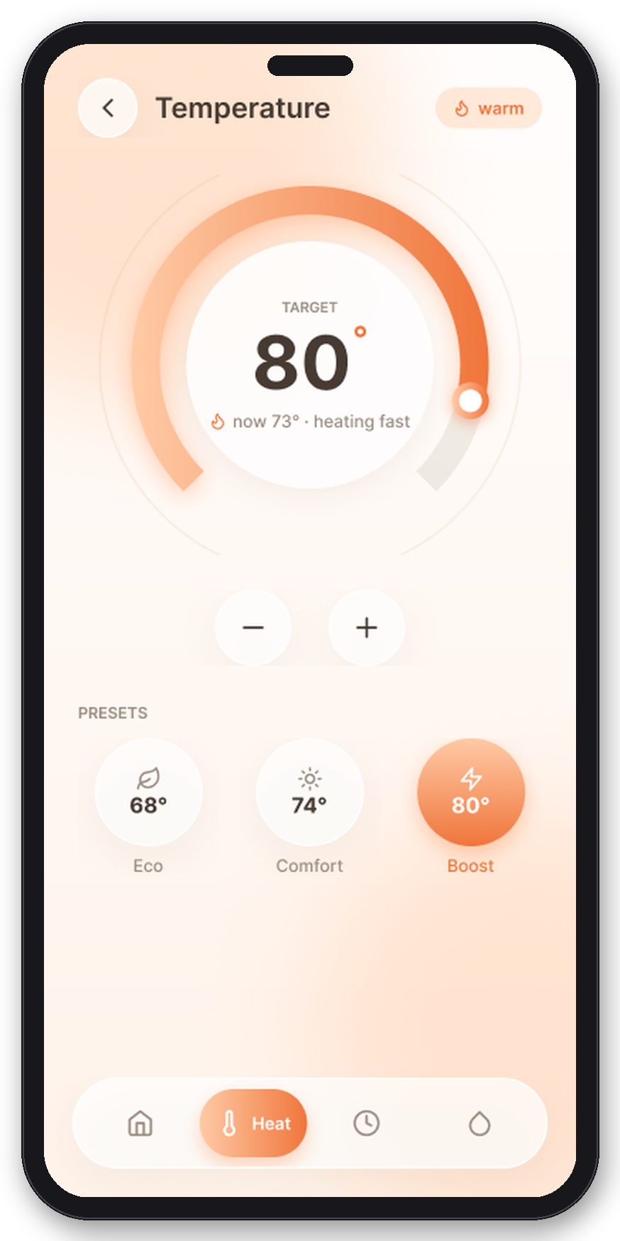
Four visual generations ended in one rule: the interface carries a single accent hue, driven by the target temperature. Set it to 80° and the whole app renders peach-white; drop to 74° and it cools to blue-white. The accent stopped being decoration and became a readout you can read from across the room. Green was removed entirely; recycled heat became information, not a color.
03 · A timer you can see
Twenty-four hours as a ring, and a heater that follows the PC.
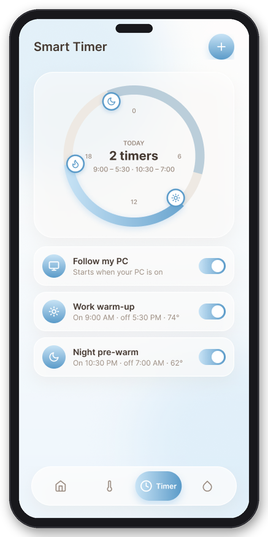
The streamer persona never wants to schedule anything twice. The smart timer draws the day as a ring with on/off arcs you drag, plus presets and one honest automation: Follow my PC, which starts the heater when the rig spins up. Copy-to-weekdays removed the most repetitive task in v1, editing the same schedule five times.
04 · Water is a state, not a toast
When the tank runs dry, the whole app says so.
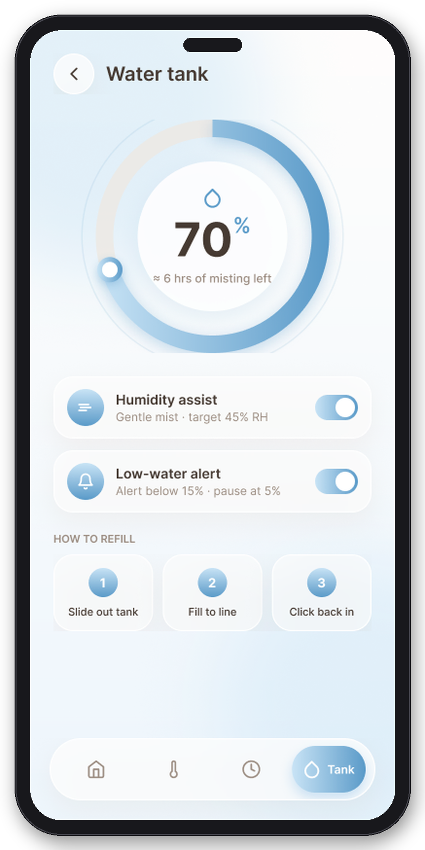
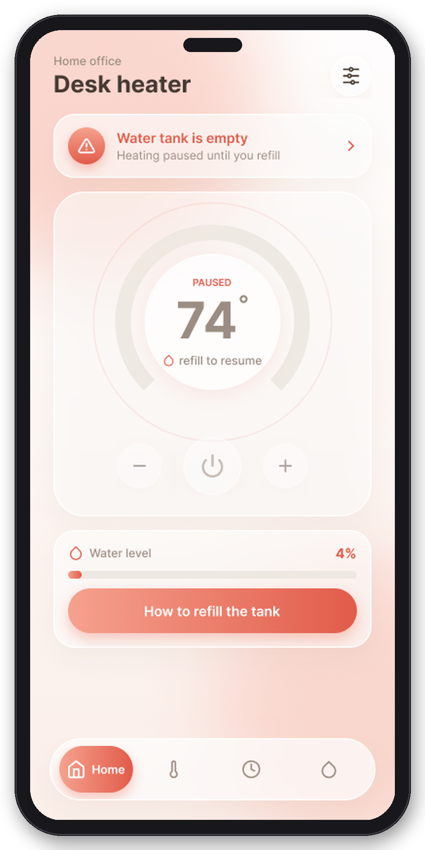
v1 announced an empty tank with a gray toast you could miss. Now low water is a device state: a coral blocking banner, the dial visibly paused, a live tank level, and a how-to-refill action. Coral is reserved for exactly this class of moment, which is why it can interrupt.
05 · Pairing that forgives
QR first, serial as a fallback, and a failure branch that was designed, not discovered.
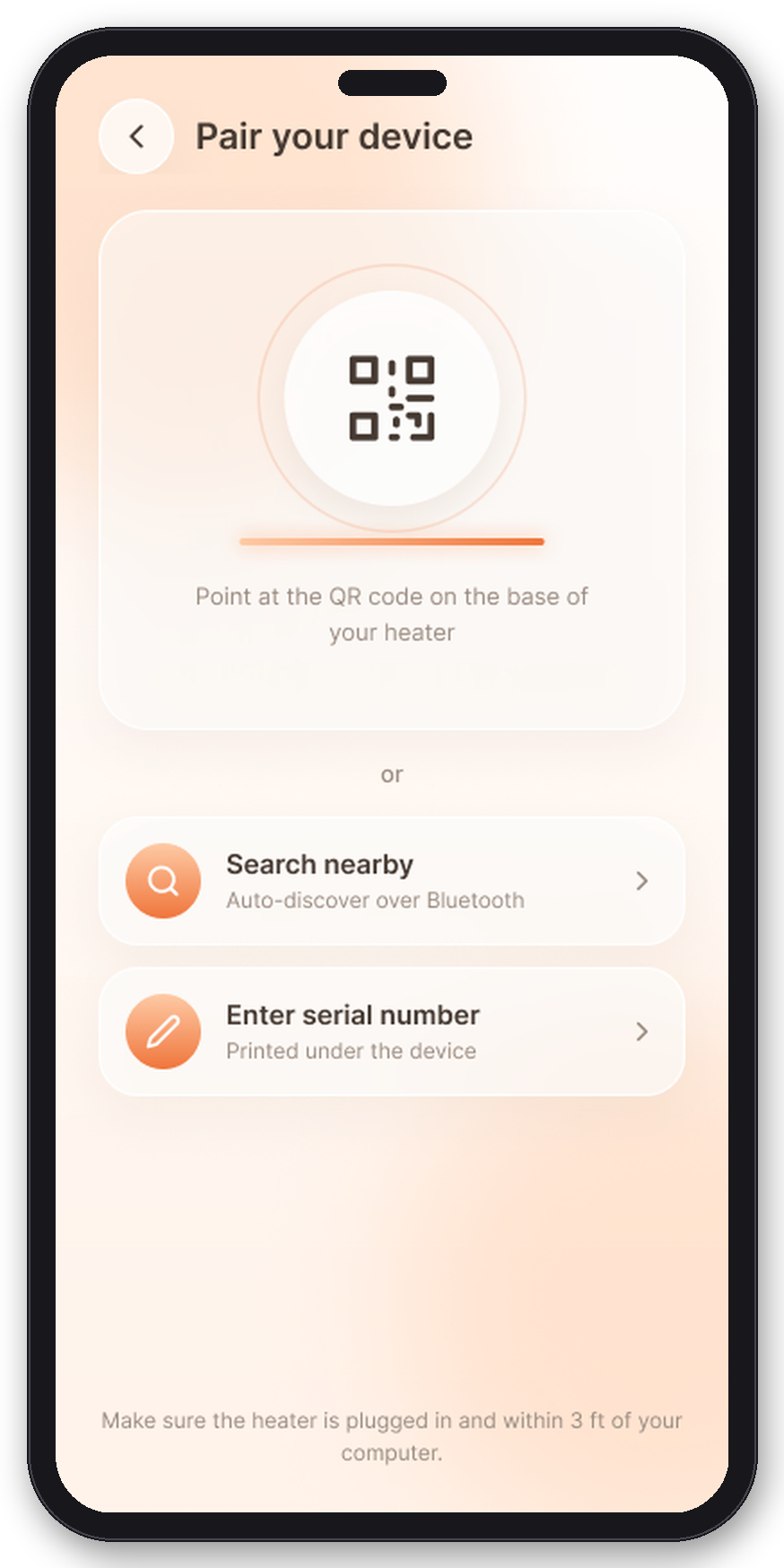
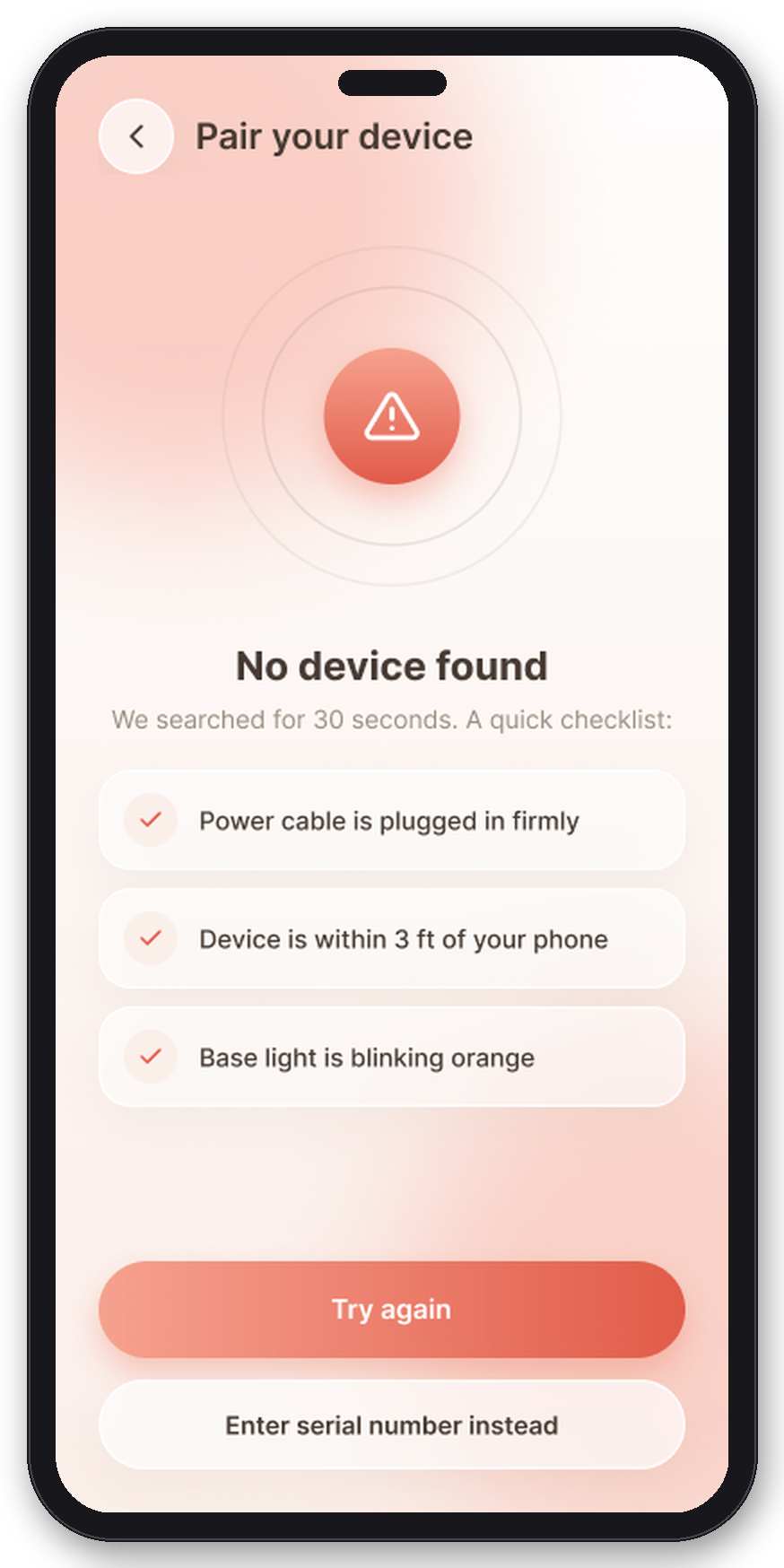
Setup leads with a QR scan, offers Bluetooth auto-discovery second, and keeps the serial number as a typed fallback. Searching, not-found, and retry are real screens with real copy, because the audit showed the first minute is where the product either earns trust or loses the user.
06 · Proof on the meter
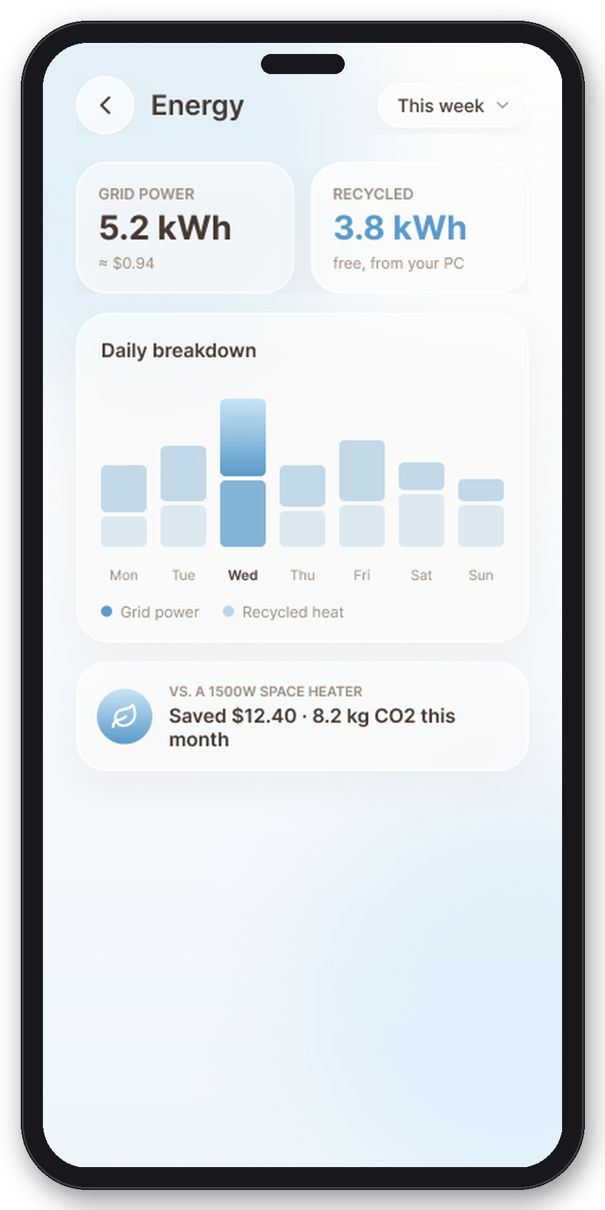
Recycled watts against grid watts, in numbers a renter can repeat.
The Energy tab reframes consumption as a comparison: how much heat came free from the PC versus what the booster drew from the wall, and what that means against running a 1500-watt heater. The sustainability pitch becomes a number you can say out loud at dinner.
// How I got here
Six generations, each answering the critique of the last.
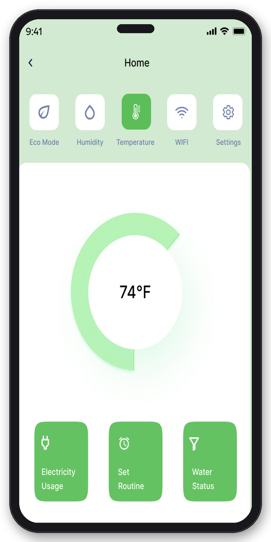
v1 · Mint monochrome. Two navs, one number, no story.v2 · Structure first. One IA, correct but generic.v2.5 · Ember dark. Strong mood, heavy for home comfort.v3 · Soft glass. Right direction, three hues competing.v4 · Thermal Mono. One rule replaces three palettes.+ 2019 flat. The same system, rebuilt era-accurate.
// The hardware
A felt-wrapped box that drinks from the PC’s exhaust.
HL-01 concept · Ø60 intake duct pulling 35–45°C exhaust · up to 60% of output heat recycled · under 24 dBA · 0.8 m comfort radius · 300 ml evaporative tank
// Outcome
What a student project can prove, and what it honestly cannot.
27 → 18screens: audited, rebuilt, complete with auth, failure and empty states
1information architecture: Home / Schedule / Energy / Devices
AAcontrast on every text pair, both builds
×2complete visual builds: Thermal Mono and a period-accurate 2019 flat
There was no user lab on this one, so the numbers above are about system completeness, not behavior. What I would test first: pairing success rate on the QR-first flow, whether five users can read the warm/cool accent as device state without being told, and the dial gesture on one hand.
Somewhere a 5G tower is on fire because a post said so. The fact-checks exist — on sites nobody visits, published days after the claim has been shared a million times.
RAN (V.O.) — Fact-checkers tell people what is false. Can a tool train people to sense it — at the exact moment they're reading?
The research points one way: corrections shown after belief forms tend to backfire. But committing to a judgment first, then facing the evidence, measurably improves discernment.
"So FALZ isn't a fact-checker with a score attached. It's a judgment game with a fact-checker inside."
Born in a four-person hackathon in 2020, where I was the team’s UX designer. The identity stays: newspaper, not dashboard. Black and white, a Didone italic wordmark, questions set in serif. In an editorial world the strongest UI element is a word — a full-bleed italic "False."
Accent grammar on newsprint: gold = unverified & scores · red = disputed · white = true. Verdicts are typographic events.